From March 2016 to January 2017, I worked on the Community and Creative Enginering team at DigitalOcean. The primary product that I worked on was DigitalOcean’s Community website, where I added new features and implemented redesigns for others. Here are some highlights of what I accomplished during my time on the team.
Also, shout out to Caylee Betts for all of the designs. She was an awesome coworker and I loved working with her on these things.
Note: Since switching teams, there were changes made to the CSS of the codebase, so if some things look out of place, it’s most likely because the pictures were taken after I left the project.
New Question Submit Page
In order to increase engagement, we decided to improve the question submission process in the Community website. The old version of this form had issues with accessibility and overall UX and needed to be revamped. It was also the first view within the application that we rewrote in Ember.js. I rewrote this entire view on my own, in addition to figuring out how to piece together and Ember.js application into a Rails application piecemeal.

After this feature launched, there was a 28% improvement in the success rate for number of people who viewed the question index page AND submitted a question. Not bad, in my opinion. My coworker, Caylee Betts, did a wonderful job with the design and it was a pleasure working closely with her on this.
User Stats and Profile Page
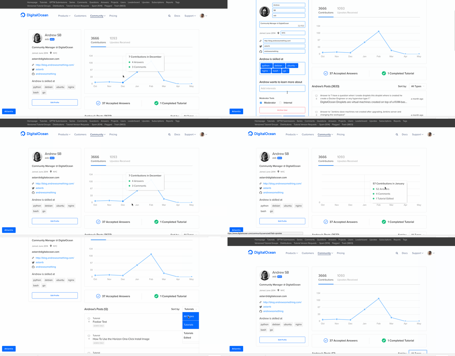
Another part of the website that needed some tender loving care. The old version of the user profiles did not really convey as much information to the user as it could. So we decided to revamp the entire look and feel of the user profiles, in addition to adding in new features such as location and user statistics. The data visualization for user statistics were built using C3, a charting library based on D3.


This revamp of the profile page resulted in a 41% increase in pageviews to the user profile pages over the first 3 months of launch, more than the overall growth of the Community application itself. Once again, Caylee knocked this design out of the park.
Convert Comment to Answer Button
A problem that was very common within the Community team at DigitalOcean is that people were answering questions to questions in the platform, but it would be as a comment to the question rather than an answer. So they wanted an easy way of converting those comments to answer. I was responsible for building a button that with a click will convert said comment to the answer and link it.
Picture unavailable
Mark Answer as Accepted
Another feature we added in was marking an answer as accepted. There were various answers to questions but unless the person who asked the question replied to an answer and said, “This worked!”, other users wouldn’t know that it was the right answer.

New Filtering Flow for Tutorials, Questions, and Projects
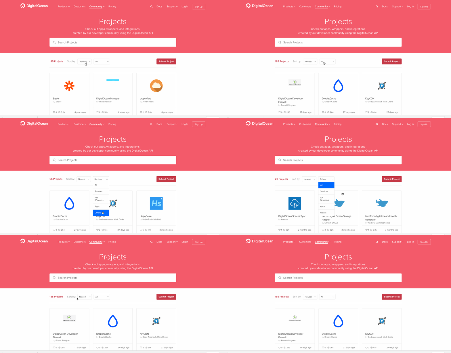
Before, we had a somewhat confusing navigation flow for filtering through data on Tutorials, Questions, and Projects. Rather than using navigation links to filter, we decided to improve the flow through usage of a dropdown menu, which also became more aesthetically pleasing to look at.

Data Driven Decision Making through Segment
When we were unsure how users were using parts of the website, we started to use Segment for tracking how users are using the application. This allowed us to rethink parts of the application that weren’t getting as much usage as we wanted and how we could improve upon that.
Front-End Error Monitoring
Before, DigitalOcean’s Community site had no error tracking for the front-end application. So there were JavaScript errors that were being silently thrown for users. One of my ideas was to implement tracking for the Community front-end via BugSnag, which informed us of many unhandled errors being thrown by the front-end. We were able to tackle these exceptions in subsequent sprints.
Onboarding Modals
For new features, we introduced the concept of modals for announcing them to the users. We created onboarding modals for three features: the new upvotes system, accepted answers, and the new user profiles page. After the user exits any modals, they will never see it again.


Conclusion
Overall, I enjoyed my time working on the DigitalOcean Community product. It was fun improving various parts of the front-end and I’m glad to see how the features I worked on led to more growth and engagement with the platform.